Guest Post: Lauren K. Cannon
SPOILER ALERT! This post contains Desert Spear spoilers. SPOILER ALERT!
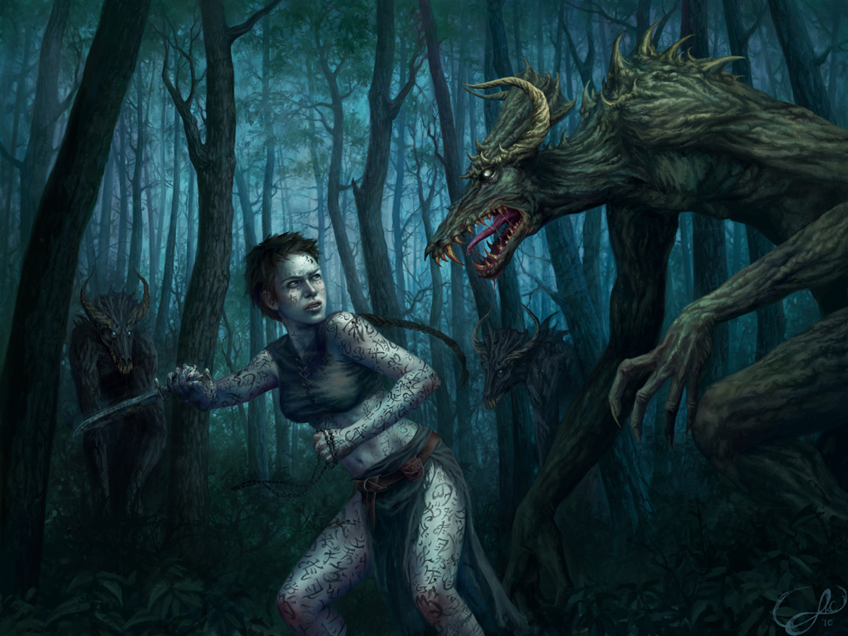
With the unveiling of our latest secret project, Peter asked me to write a guest post to show some behind-the-scenes action about creating the awesome image of Renna that now graces the site’s homepage.
My name is Lauren K Cannon; I’m a freelance digital illustrator. You can see more of my work at http://navate.com.
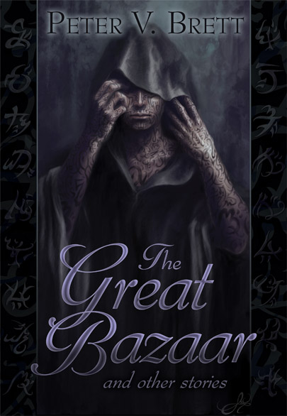
Peter and I go back a few years. We first worked together in 2007, when I designed the first round of ward symbols and painted a portrait of his title character from The Painted Man, which at that point had absolutely no notoriety whatsoever, as it was an unpublished debut novel by an unknown author. Both the portrait and the wards were initially intended to decorate Peter’s website. But once The Painted Man was released, everyone decided it was really, really awesome. The image of Arlen went on to become the cover of The Great Bazaar short story collection, and the wards—well, they are everywhere these days!
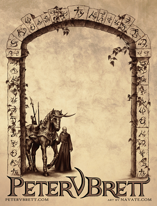
More recently, I designed the second round of ward symbols found in The Desert Spear and created the illustration on those awesome bookplates Peter’s been plastering everywhere. Watching Peter’s ascent from unknown to best-seller has pretty much been the coolest thing ever.
After the success of The Painted Man, Peter told me he wanted a new character portrait for when The Desert Spear came out, this time of a girl named Renna. We meet Renna as a child very briefly in the first book, and she develops radically over the course of The Desert Spear. Painting Renna clobbering some demons was never a question–it had to be done. But it’s also a major spoiler, so we decided to keep the project under wraps until people had the chance to find out themselves exactly what Renna becomes.
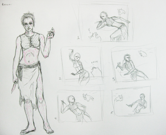
Peter gave me an ARC of The Desert Spear so I could get to know the character before I painted her, and the end of the book ended up giving me a perfect reference point for the illustration. Initially, when I did compositional sketches for Peter to review, I had a more general action shot in mind.
But the more we talked the more we both gravitated towards illustrating a scene right out of the novel. Chapter 30, where we first see Renna being badass, was an obvious choice, but first an issue with the character sketch had to be addressed. Apparently I drew Renna’s knife WAY too small. Peter kindly corrected me:
I should have known Harl was compensating for something.
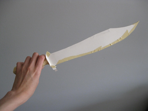
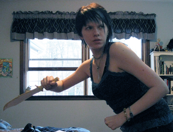
For reference, I built a scale model of the knife out of some mat board, modeling the design after the avatar image Peter drew for Renna’s chapters. I have to do stuff like this a lot for reference material and I can never decide if it makes me feel awesome or silly.
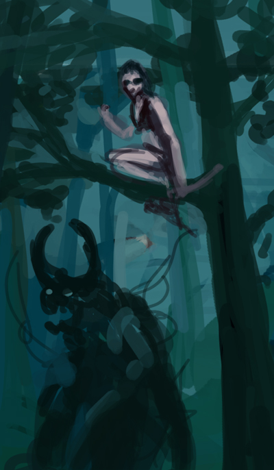
From there we moved onto color concepts… for the artistically inclined, I do my digital work in Adobe Photoshop and Corel Painter with a Wacom Intuos4 tablet. We fought a bit between the scene at the beginning of Chapter 30 where she’s lurking above the rock demon, or battling the wood demons a few pages later. I did quick color sketches of both for Peat to choose from. Wood demons won.
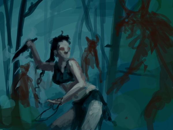
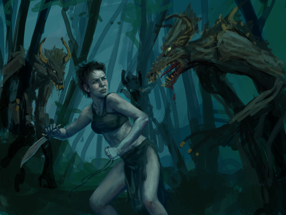
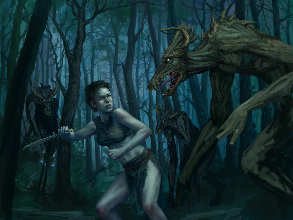
The first stages of an image are often quite awkward—I try to get an idea of what will be going on without committing too much. It’s very experimental and normally I hide my work-in-progress images far from public eyes until they are past the “growing pains” stage. Here, all I’ve got is Renna in a defensive position with a scribbled demon looming over her, and other lurking in the background. Important plot elements—her knife and her necklace—are both in hand.
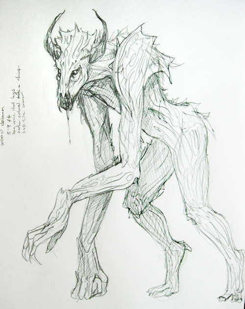
I asked Peter for some help in designing the wood demons. He described them quite sparsely in the books, which I love as a reader but not as an artist. He directed me towards some fan art and official art from foreign editions of the books, and gave me a few insights of his own. From all that I conjured up a creature that was built along the lines of a giant gorilla, but agile and elongated with limbs that could be mistaken for thick tree branches and bark-like body armor.
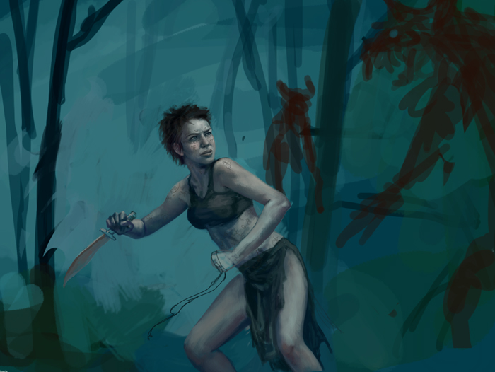
I started working on the designed of the demons into the main image, and fleshing out the scene some more. Renna’s anatomy is still a mess at this point.
Ah, here it starts to come together!
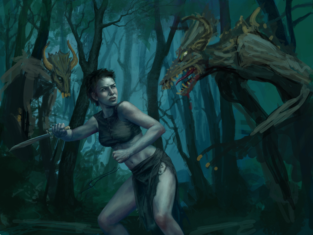
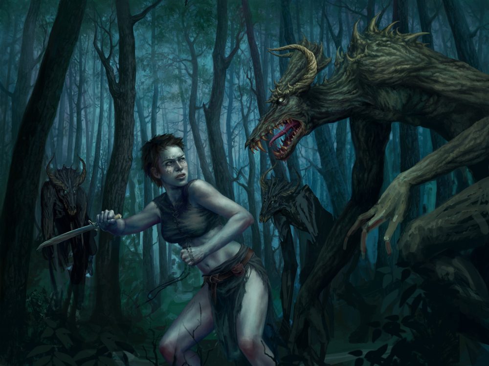
Finally confident in the pose, I started playing around with the rest of the image. Started to refine the demon a bit and also decided to open up the composition to give the action more breathing room, and to make the demon more imposing. I also pushed the second demon way back so that I could add a third.
Forest painting time. Depending on my mood forests are either incredibly zen or pure torture. This one wasn’t too bad. Some lavender tones started creeping in at this point and I love how it added depth to the color scheme.
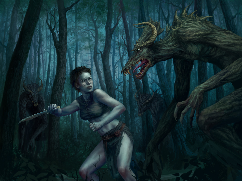
Everything is just getting detailed at this point… leaves on the trees, texturing the bark of the demons’ skin, sketching ward patterns onto Renna and tidying up her clothing.
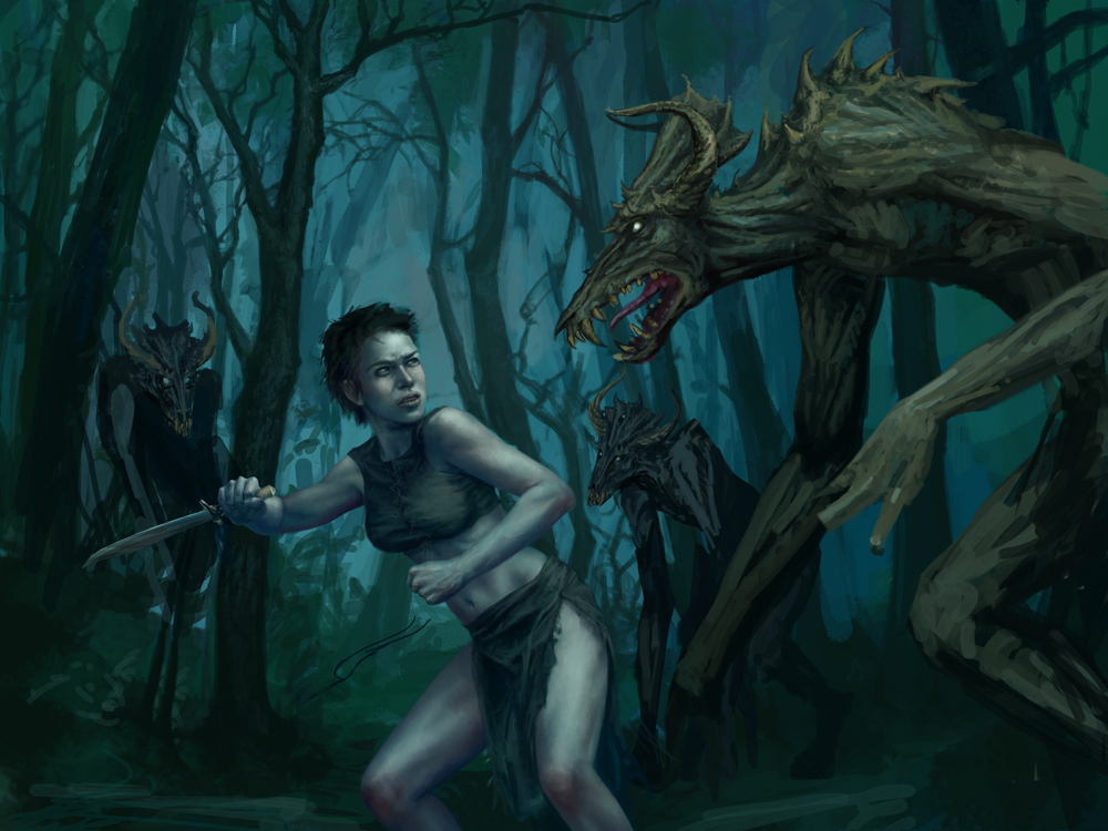
Getting close to being finished here: the forest is finished up, as are the two demons lurking in the back. The main demon is finalized.
Ah, the final stage! I left the details on Renna for last. The knife, the necklace, her braid, and of course her wards. I’d been playing with the layout of her wards on and off throughout the painting’s creation, hiding the sketches on a separate layer. This allowed me to move them around without messing up the figure. It probably sounds bonkers, but figuring out warding patterns is really time consuming and difficult. I ran into the same thing when I painted Arlen. Peter has mentioned he has a sort of math behind how the wards are supposed to interact, but I am glad he hasn’t told me. I have enough trouble making it up as it is. A few finishing touches and splatters of demon ichor, and we’re done:
This is by far my favorite project from Peter. I haven’t had the chance to do many action-based artworks, so it was a great opportunity to challenge myself (always a good thing!). Not to mention, being able to create an image that was so much more immersive than anything I’d done for him before was awesome. Reading fantasy novels as a kid is what got me interested in art in the first place, and now I’ve got a best-selling fantasy author on my client list. Dream come true? Pretty much.
May 10, 2010

Love your work and the splash screen looks fantastic. Also some great stuff in your gallery.
Gorgeous work.
Really interesting to see the progression of the artwork. Nice job Lauren!
Since I first read Mister Brett mention you, I have loved your stuff lots an’ lots, and this is no different;
The main page is quite possibly the most beautiful thing I’ve seen in a very long time. It also really, really makes me want to re-read TDS, hehe.
Congrats on all counts, damn beautiful! I don’t suppose you do prints or anything d’you?
Excellent guest post, Lauren! That new Renna piece is spectacular, and looks great on the site. Look forward to seeing more of your work.
Just…wow…Thanks for letting us see how the picture developed!
Like Lauren, I too pictured Renna’s knife considerably smaller, and I remember it baffling me as to why she would want to keep using it.
I pictured it as more a sort of knife the size for cutting an apple in your hand.