Inevera Portrait: Part 1
Guest Post by Lauren Cannon – navate.com
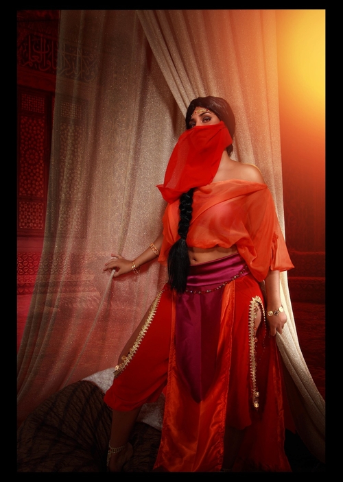
Well, this is long overdue—but at least it’s here! Last fall I had the pleasure of painting an image for the grand prize of the Cosplay contest. Peter and I both agreed that Margherita blew the competition out of the water with her amazing depiction of Inevera. Her entry was inspiring on its own, but I was also excited to explore another culture of Peat’s world. Before this I’ve only had the chance to illustrate Greenlanders like Arlen and Renna.
Since I had to paint Margherita as Inevera in the image, my process was different than usual. Normally I’m able to play around with poses and composition until I find something that’s right for whatever I’m trying to create, but for this image I was limited to the photos Margherita had submitted. I didn’t want to simply reproduce her excellently staged photos, so I decided the photo of her standing would be the best starting point. It gave me freedom to explore different scenes, rather than locking me into one moment.
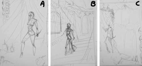
I scrawled three quick thumbnails and sent them off to Peter for his thoughts—asking if I could pretty please show our Damajah strolling the halls of Sharik Hora. He approved and chose the middle image with the stairs as his favorite.
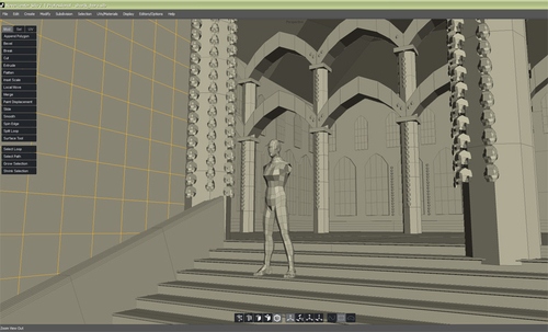
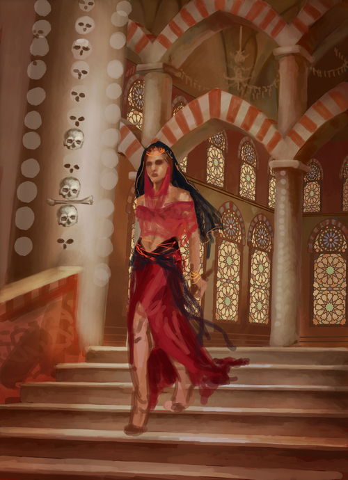
I’m not so good with pulling architecture from my head, so I fell back on my rudimentary 3D modeling skills to create a rough mock-up of the temple interior. This let me explore different camera views and also gave me a strong reference for the scale and perspective of the temple. I constructed walls, stairs, archways, and some ugly window stand-ins. I also placed a ready-made human figure for scale, and duplicated a bunch of default heads onto the pillars for size and angle reference for the skulls. Even though I knew the general angle I needed, I took dozens of screencaps until I was able to capture the precise composition I envisioned. It was a combination of the perspective of the stairs and how the pillars and arches interacted with the figure. I also wanted a slightly low angle to give Inevera a sense of power.
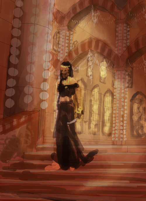
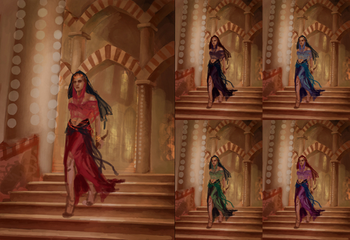
I did a quick perspective trace in Photoshop of the mockup, and threw together a rough color comp to run by Peter. All of the previous paintings I’ve done for the Demon Cycle have cool colors—dominated by blues and purples. I wanted to turn that around in this image, embrace the feel of the Krasian environment and also pay homage to the great gold and red cast of Margherita’s original photos.
Peat liked the direction, but reminded me Inevera shirked Krasian modesty and paraded around in bright colors. I did some quick color adjustments to show him how different hues would work within the overall color scheme. We both decided predominantly red was the way to go.
Around this time I took some supplemental reference photos of myself, since Margherita’s photos hid part of her legs and I also needed her to look like she was descending the staircase. I also researched mosque architecture and design and pulled up the huge folder of vacation photos I took when I visited the Sedlec Ossuary in Kutna Hora, Czech Republic—a beautiful church decorated in human bones, and Peat’s inspiration for Sharik Hora.
I created the design of the windows in a separate Photoshop document using Arabesque designs, then used the perspective tool to edit the shape to fit the windows in my painting. It was a bit tedious, but I’m glad I spent the time doing it—they’re a great little detail.
See Part 2 of Lauren’s Inevera Portrait tomorrow. To see more of Lauren Cannon’s artwork, check out her website.
Update: Check out Part 2 of Lauren’s Inevera Portrait post here.

OMG!!! That shit is Soooo funny. Earie but funny.
ooops sorry that was meant for the dismembered hand.