Inevera Portrait: Part 2
Guest Post by Lauren Cannon – natave.com
Start at the beginning: Inevera Portrait: Part 1
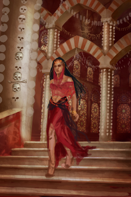
Getting down to business, I work back to front… establishing the overall lighting and palette helps me finish the figure later. I color in the stained glass of the windows, start mapping out the skulls, and begin to render the interior of the temple.
I cropped the image slightly on the sides and start playing with the values. The background is darkened so I can add in streaming light later; I also doodle in more bone decorations on a separate layer
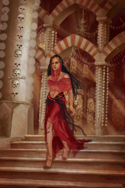
Ditched the railing on the left because I couldn’t get the perspective to make sense, but I think the replacement pillar bases look better anyway. The light is added in the back and I do a bit of cleanup on the windows. The skulls in the background were a bit of a cheat, but they still took a ton of work—I painted five skulls, then duplicated them over and over until the whole row was completed. Then I copied that row and put it on the second pillars. Since they are so small, once I am done working I know the fact that I used the same base won’t be noticed.
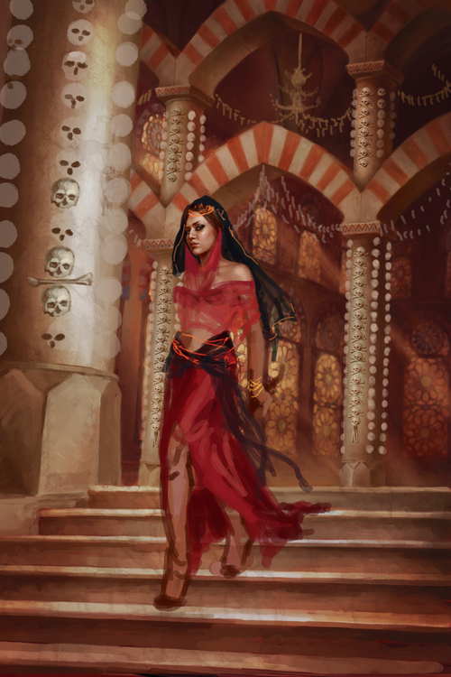
Time for a step back to make minor adjustments, perfecting the atmosphere… in this case it’s a lot of putting in slightly more contrast here, a little more saturation or darkness there, to really make the interior feel lush and real. It might seem minor and fussy, but tweaking little stuff like this goes a long way to making the final image better. Then, satisfied with the mood, I let myself indulge in the fun part and paint in Margherita’s face.
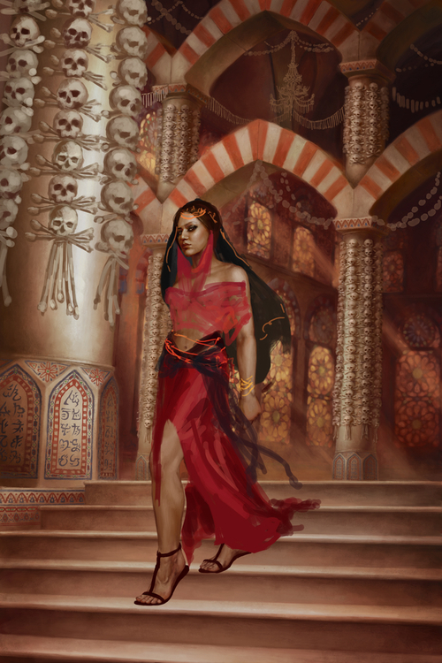
The rest of the skulls are added to the background pillars, again painting 4 of 5 of each row and then duplicating them. The skulls in the foreground are also blocked in. As much as I love painting bones, I am beginning to have skull-rage. I try to distract myself a little by also working on the pillars and the rest of Inevera’s body, which I keep on a separate layer for the scribbles serving as her clothing. Makes it much easier to get her clothing to sit on her body correctly.
The laborious task of detailing the skulls begins… each skull in the background is painted over in Corel Painter with looser brushstrokes. This gives them individuality and makes them fit in with the less sharp background. I also paint in the skulls’ cast shadows on the pillars. Kill me now! Another bone break is taken to work on Inevera’s sexy legs, the stairs, and the warding on the pillars.
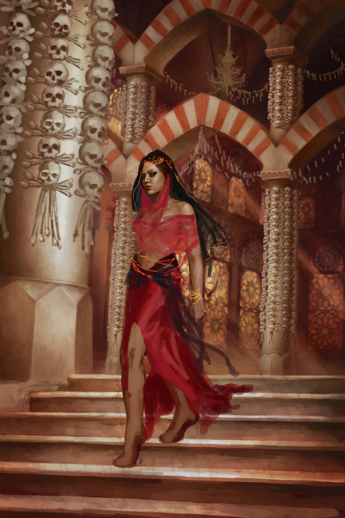
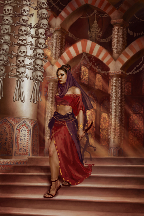
I do a quick color shift in Photoshop to bring out the red tones a little better and give more depth to the background. I also finally start to tackle Inevera’s sexy costume… a few purples are added for variety. Then back to those damn skulls, this time the decorations in the ceiling and the skulls in the foreground. I am very thankful for my endless skull reference supply from my Ossuary trip at this point – since these skulls are so big, they need to all look different! I begin sending Peter hourly angst-ridden text messages about how much I hate skulls. Whose idea was this anyway? Oh right… it was mine.
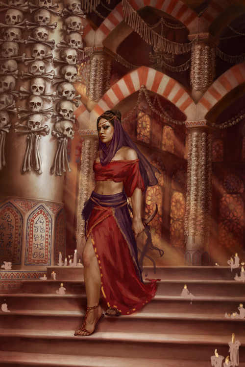
THE SKULLS ARE DONE. Some more cast shadows to anchor them down, and another string of bones on the ceiling, and I prepare to throw a party. But instead I realize that thanks to all the detail I crammed into the temple, the stairs look woefully bare. So I fall back on a great composition technique called “add more stuff”. I doodle in some candles. It isn’t very practical, but it fixes my problem, and maybe it also satisfies a private wish for Inevera’s skirt to catch fire.
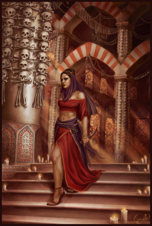
Then it’s the home stretch… just a matter of finishing up the last bits of detailing and putting in small touches… the candles are rendered; Inevera’s clothing, jewelry, knife, and belt are all finished up, and she’s given a cast shadow. Then I call it a day, and send her off to Peat for final approval. Finished!
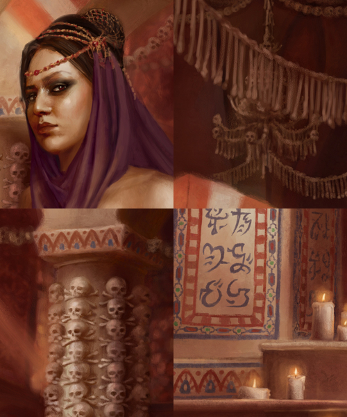
Here are some closeups…
I’m really pleased with how it turned out. I took a lot of risks, attempting a level of detail I’d never done before, an environment I knew I’d struggle with, and a palette I wasn’t initially confident I could manage, but it all paid off in the end. One of the coolest things about working with Peat has been how my illustrations over the years are now a roadmap of my growth as an illustrator. He picked me up when I was just a wee art student, and every illustration I do for The Demon Cycle turns out better than the previous one.
Margherita, thanks again for your awesome winning entry to the contest—it was a pleasure! 🙂

I love this. The images in the gallery of natave.com are amazing.
Gorgeous! I’ve always wanted a detailed explanation of your process…
Simply stunning, love the attention to detail.
I always love getting a look into the process of artists. Seeing the final piece slowly come into focus, with all the intricacy and detail….a little bit astonishing. Ta muchly!