TDW Covers: Gandalf/Inevera or Bribery
Posted by Meg
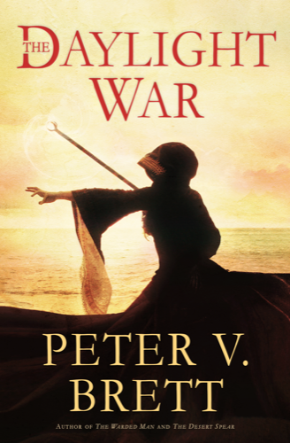
A gorgeous entry from Natasa in Wales:
Here is what Natasa had to say about her entry:
The first time I read The Warded Man was a few months after its release and was immediately hooked. I obsessively counted down the days until The Desert Spear as any fangirl would do, and pounced on it the moment it was released. Sadly I didn’t have the starry eyed reaction I was expecting after I finished reading it (to be fair, it was quite awesome), but I guess that’s what overhyping yourself up to something gets you.
One thing that did stick out for me though was Inevera, and although I’m a little hazy on the details—it’s been over two years since I read The Desert Spear—I remember how powerful and seductive she was (it also helps that she pops up in the Peephole more than any other character other than Arlen :P). This is what I wanted to portray on the cover I created for The Daylight War. I know I didn’t get the seductive part down but I hope I’ve successfully captured the power that Inevera exudes 🙂
Her profile looks beautiful against the sun and water, and I adore the trailing sleeves. She looks like a badass witch about to cast some major spells with that Gandalf-esque staff of hers. So, I would say that Inevera’s powerful spirit came across quite well! Awesome job!
Ward’s entry is a little tongue and cheek.

Here’s what Ward had to say about his entry:
I made this because there was a shocking lack of glitter. I had glitter glue, but I was afraid it would mess with the cover of my favourite book. Also, I added a little incentive of the Canadian Monopoly™ money variety *wink wink, nudge nudge*.
Now, I leave you with a quote. of sorts, augmented to fit my art project.
BURNS PEAT Could you explain your model cover, young man?
GRIMES What’s to explain? He’s an idiot!
LENNY Pipe down!
HOMER WARD Well basically, I just copied the plant we have now. cover of the first book.
BURNS PEAT Mm-hmm.
HOMER WARD Then, I added some fins to lower wind resistance propped it up on a tissue box with a cool rock design. *(pointing)* And this racing stripe Canadian money here I feel is pretty sharp.
BURNS PEAT Agreed. First prize!
Well, this is the only cover actually attached to a book! Seriously though, this entry cracked me up and I am a fan of the shimmering animation on the title. Great idea, Ward! Thanks for entering.


I can honestly say that I would pick up Natasa’s version of TDW & give that blurb a thorough perusal. No question. Nice!
Also, shame about the lack of glitter, Ward, the world could do with more glitter….