U.S. Daylight War Cover Revealed
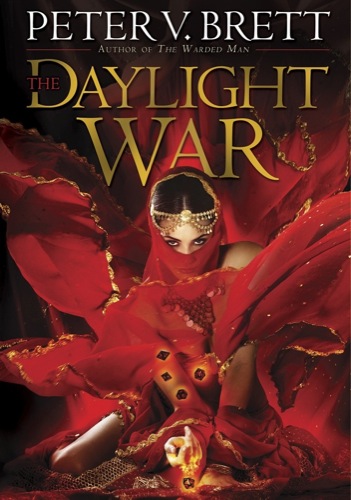
The U.S. cover for The Daylight War is here at long last, and it’s breathtaking.
If Warded Man is Arlen’s book and Desert Spear is Jardir’s, Daylight War is very much Inevera’s, and I am so thrilled with how the cover came out. It is exactly what I asked them for and captures the character of Inevera perfectly. Artist Larry Rostant and art director David Stevenson did an amazing job. I thought it would be impossible to love a cover more than Desert Spear, but Rostant has raised the bar again.
I was floored to have Entertainment Weekly break the story on Wednesday with an exclusive excerpt. As you know, SF often gets short shrift in mainstream press. If you haven’t already, I encourage you to click through and read. Please also take the time to like or comment on the article, and help show that genre readers are a force to be reckoned with. I would be thrilled to see this sort if thing happening with other genre books.
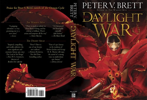
Done? OK. Now back to awesomeness. Check out the front and back covers together. You may notice these images are slightly different from the cover that debuted in EW. Rostant made some nice finishing touches.
I love the flow of the robes in the darkness. Those are going to look amazing in the ANIMATED BOOK TRAILER we’re working on. If you haven’t already, check out the Daylight War prologue teaser featuring Inevera.
What do you think of the new cover? Let’s us know in the comments or check out our new Daylight War forum for further discussion.


This is seriously beautiful!
One of the most gorgeous and fitting cover I actually have ever seen… Congrats!
Like I said on FB when I first saw it, I really like this cover. It’s gorgeous, and it has all those little details in it that remind me of Inevera, it’s not just a random woman dressed up like an Arabian woman, there are more details to it than that.
Beautiful cover! It’s sexy, seductive, powerful, and dangerous. You could also throw in mysterious as well. The flow of the robe is perfect
Seriously awesome cover! Love it!
I love it!
Absolutely stunning cover. The wait for the book is killing me.
Cant wait for Polish edition!
Wow, this is gorgeous. Front and back. I would pick this up to read it based on cover alone.
[…] Peat shares thoughts on his cover HERE! […]
[…] Peat shares thoughts on his cover HERE! […]
The ciover looks great!
But what I am afraid of is that by buying this version I would break the design style which goes through the other two books I bought.
The publications of both The Painted Man and The Desert Spear look like this
http://www.weltbild.de/media/ab/2/019583544-the-painted-man.jpg
and this
http://ecx.images-amazon.com/images/I/51QapW1afjL._BO2,204,203,200_PIsitb-sticker-arrow-click,TopRight,35,-76_AA300_SH20_OU02_.jpg
I was very eager to find the second book with a matching cover style.
Will there also be version of the cover in this style? Can you tell anything? Since I like to own a book series designed in the same type of cover design.#
Kind Regards from Germany! (Well – I am reading the english version just to make sure to read your story and not the story of the translators 😉 ) I am so looking forward to reading the third book. Please keep up the great work!
Hi Rodger,
I think the covers are very much in the same style. They were done by the same artist. If you man the title fonts, this is because you have the UK publications, rather an the Us, wher ethey use different typeface,.
However, the UK publication will have a different cover in any event.