Daylight War: Evolution of a Cover (1 of 3) – Intro
Posted by Peat
I like to think that I write pretty good books, but so do a lot of people. While my words may keep people turning pages and/or coming back for sequels, the thing most likely to get a new reader pick up a book in the first place is the cover. The cover is what makes the book stand out (or fail to) on a bookshelf, or table display, or computer screen. We tell our kids to never judge a book by its cover, but let’s be honest: we give our kids a lot of advice we don’t follow ourselves.
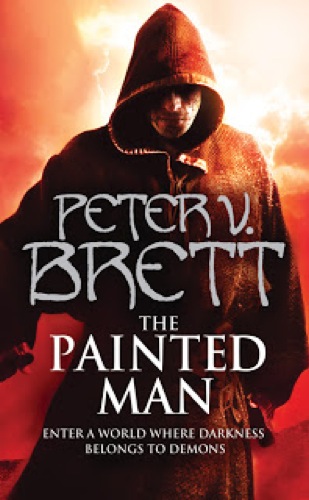
I owe much of my success to the good fortune of having been paired with the amazing photographic illustrator Larry Rostant for my cover art. For my first book, The Painted Man, this was just in the UK with my publisher Voyager, but the dramatic sales difference between that and the US counterpart (The Warded Man) led my US publisher, Del Rey Books (after some lobbying by me), to shift to the Rostant design as well. My agent recently did a blog post on SFSignal about this very thing.
You can judge for yourself if the switch was a good idea:
By the time my second book, The Desert Spear, came out, Larry was locked in for both markets and turned in a cover that to this day I hold up with no ego as one of the most compelling and powerful fantasy book covers I have ever seen:
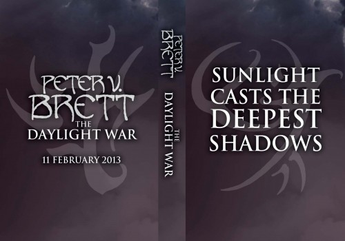
So obviously the bar was high for the third book in the Demon Cycle, The Daylight War. So high, in fact, that designs went back and forth literally for YEARS, and even then, the cover was still being tweaked when the advance read copies (ARCs) were released:
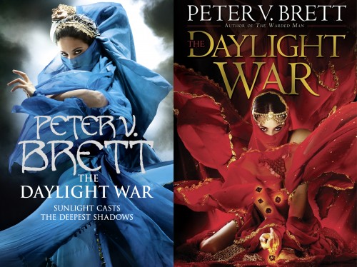
What’s more, we ended up with two completely different (though equally spectacular) Rostant covers, one in the UK and one in the US:
How’s we get there? Well I’ll tell you. And you know what? I’ll throw in a crapload of incredible never-before-seen Rostant art in the process. Even though these images never made the final cut, they are all gorgeous and deserve to be enjoyed.


[…] ~ Peter V. Brett […]